MMMMM.
MMMMM.
STUDIO
STUDIO
EVIIVE
EVIIVE
EVIIVE
Client
Client
Client
EVIIVE AG
Service
Service
Service
Brand Identity

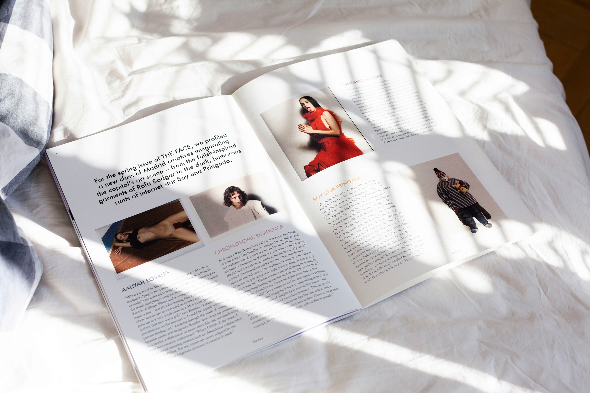
The ask
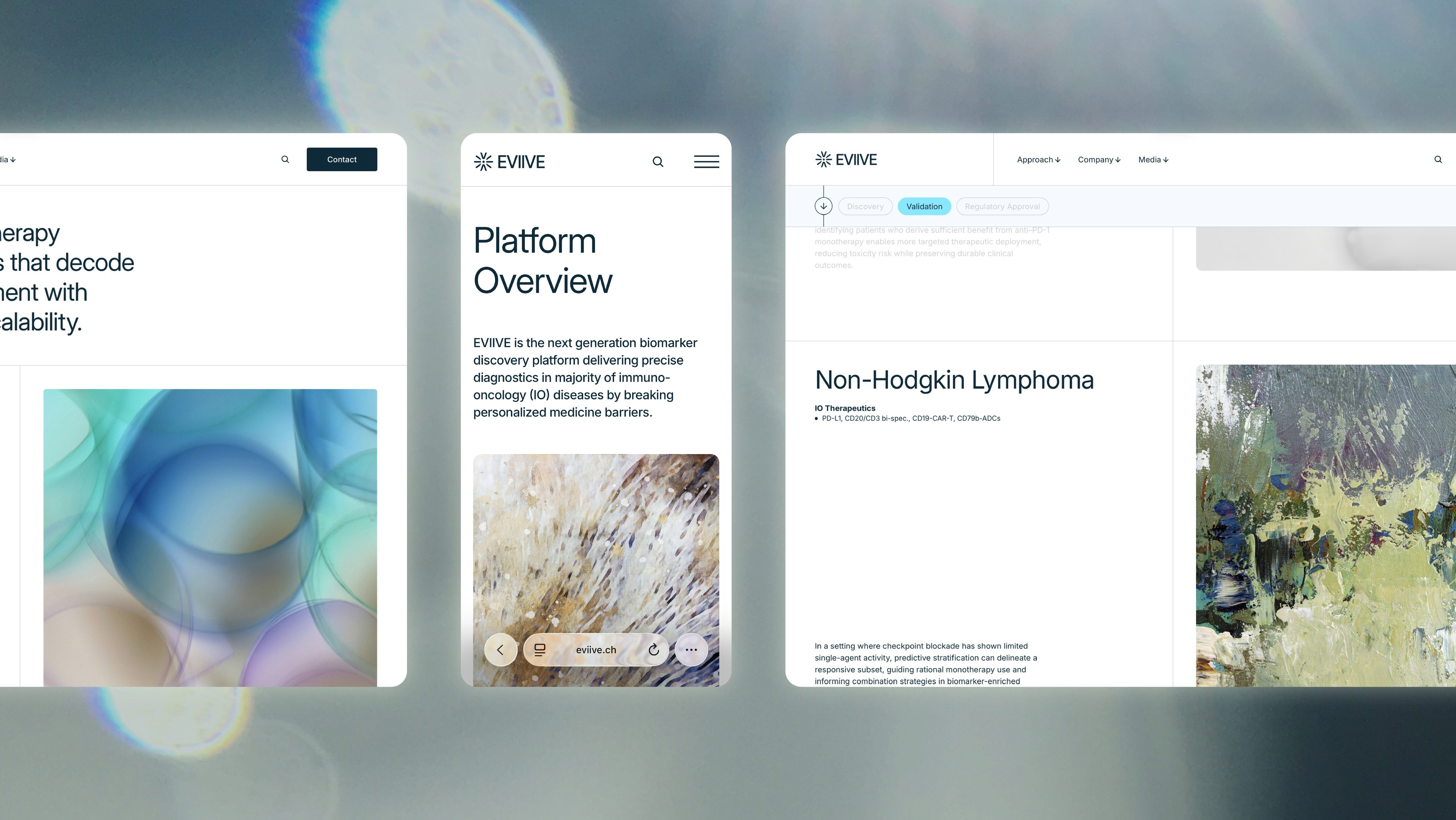
Most of EVIIVE’s work happens in places the world never sees—inside labs, inside data sets, where progress feels quiet but monumental. That’s the nature of science. But when the company asked us to shape its brand presence, we knew it needed the same clarity and precision that drives its research—without losing the sense of possibility that makes its mission bold.
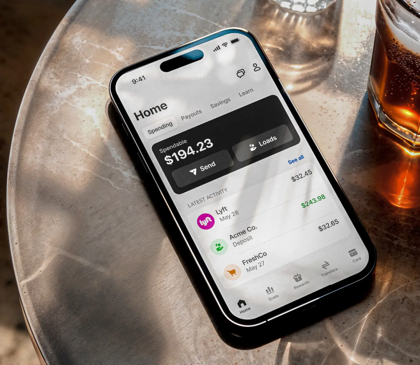
We started with color. Deep, grounded blues became the anchor—tones that signal trust and scientific rigor. Around them, brighter hues cut through with energy, a reminder that this isn’t just theory; it’s innovation in motion. Together, they create a balance between stability and progress, the known and the next.
Typography followed the same idea: familiar enough to feel trustworthy, refined enough to carry authority. Inter gave us that middle ground—a modern evolution that’s clean, approachable, and sharp in all the right places.
The visual system is a way for EVIIVE to speak with confidence and intent, whether to researchers, investors, or anyone ready to believe in the future of personalized treatment in immuno-oncology.
Most of EVIIVE’s work happens in places the world never sees—inside labs, inside data sets, where progress feels quiet but monumental. That’s the nature of science. But when the company asked us to shape its brand presence, we knew it needed the same clarity and precision that drives its research—without losing the sense of possibility that makes its mission bold.
We started with color. Deep, grounded blues became the anchor—tones that signal trust and scientific rigor. Around them, brighter hues cut through with energy, a reminder that this isn’t just theory; it’s innovation in motion. Together, they create a balance between stability and progress, the known and the next.
Typography followed the same idea: familiar enough to feel trustworthy, refined enough to carry authority. Inter gave us that middle ground—a modern evolution that’s clean, approachable, and sharp in all the right places.
The visual system is a way for EVIIVE to speak with confidence and intent, whether to researchers, investors, or anyone ready to believe in the future of personalized treatment in immuno-oncology.